
Aging in America
About
The Aging in America conference is the essential resource to cultivate leadership, advance knowledge, and strengthen the skills of those who work with, and on behalf of, older adults.
The Solution
Create a unique tone for the conference that will get past attendees excited to attend again and attract new ones to the event.
The Problem
The current conference has no excitement, sense of identity, and the information is presented in an overwhelming way.
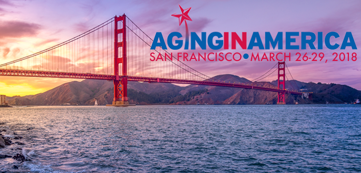
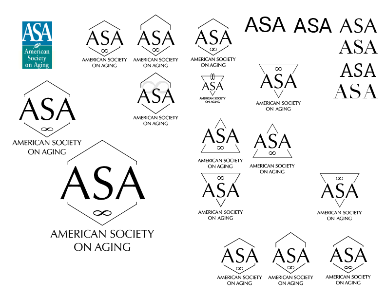
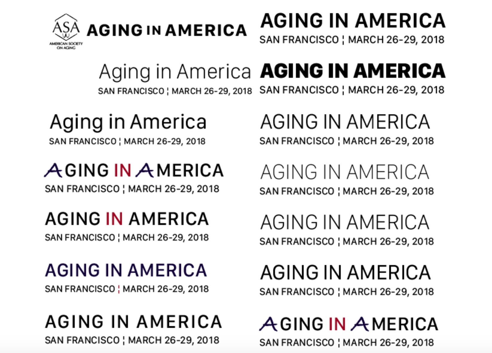
Logo Progression
The original logo is clearly outdated and needs a bit of a push into the modern age. The original hero image also has a lot going on but it's not working together with the type over the image. First, updated the ASA logo to have a modern aesthetic yet still being able to remain timeless for generations to come. Then focused on the Aging in America hero logo. It has a clear and legible type face with an accent color to break up the text in a harmonious way. The red accent on the bottom line is to pay homage to the San Francisco bridge with the color and a very simplified two stacked blocks as seen on the bridge of the main pillars that have the spaces in it.
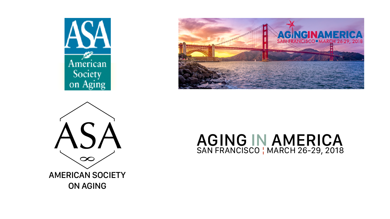

Final Outcome
The old logo and identity has a dated look and doesn’t follow a cohesive theme for the conference. The solution gave the logo a modern aesthetic and the new typeface improves legibility for all potential audiences.
Mood Board
This shows the decided direction to take the brand of the conference. It's called Long Live Fun. The colors resemble that of the San Francisco bay where the conference takes place. There are hand drawn doodles on some of the photos to give a fun and playful tone to the intense red and teal colors. It’s a lively mood while still not being overly child like.

Style Guide
The four main colors are represented with the hand drawn lines that will be used throughout the identity of the brand. The first color is a deep blue that is almost black that is used when black isn't necessary. The red pays homage to the San Francisco bridge along with the other two colors. The teal represented the color of the bay and the last color "Fog" for the famous fog that San Fran is known for over the bay.
San Francisco type face was chosen because it was developed by Apple as one of the easiest fonts to read on all the different platforms we have in this day in age. It was chosen as the main typeface so that no matter who attends the conference, young adult to senior, they wouldn't have an issue with reading any of the signage. It's also a nice touch that the typeface is called San Francisco which fits nicely into the identity of the brand.

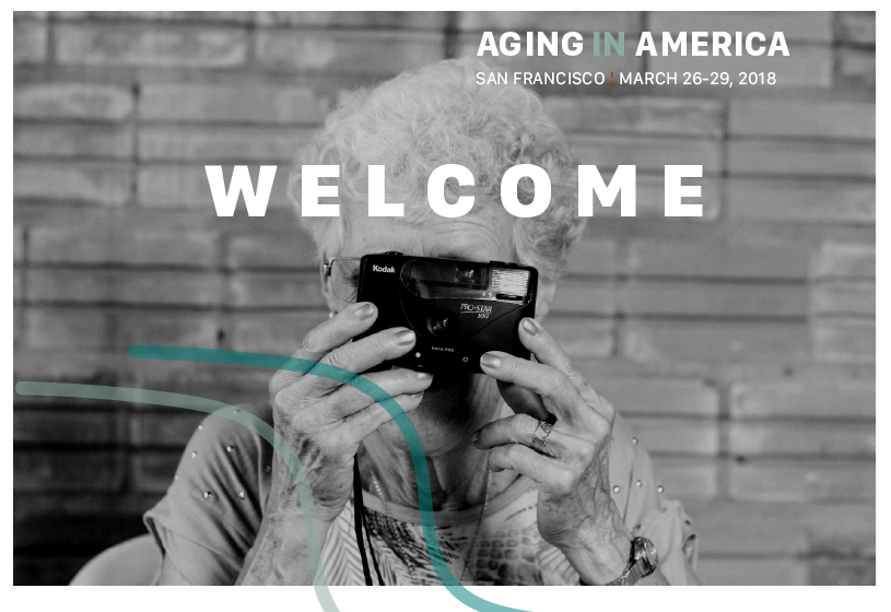
Hero Image
The new hero image shows the way that all photography will be treated. High contrast black and white photos of senior citizens having fun, smiling, and happy. Then the hand drawn colorful lines add playfulness to the otherwise intense imagery.

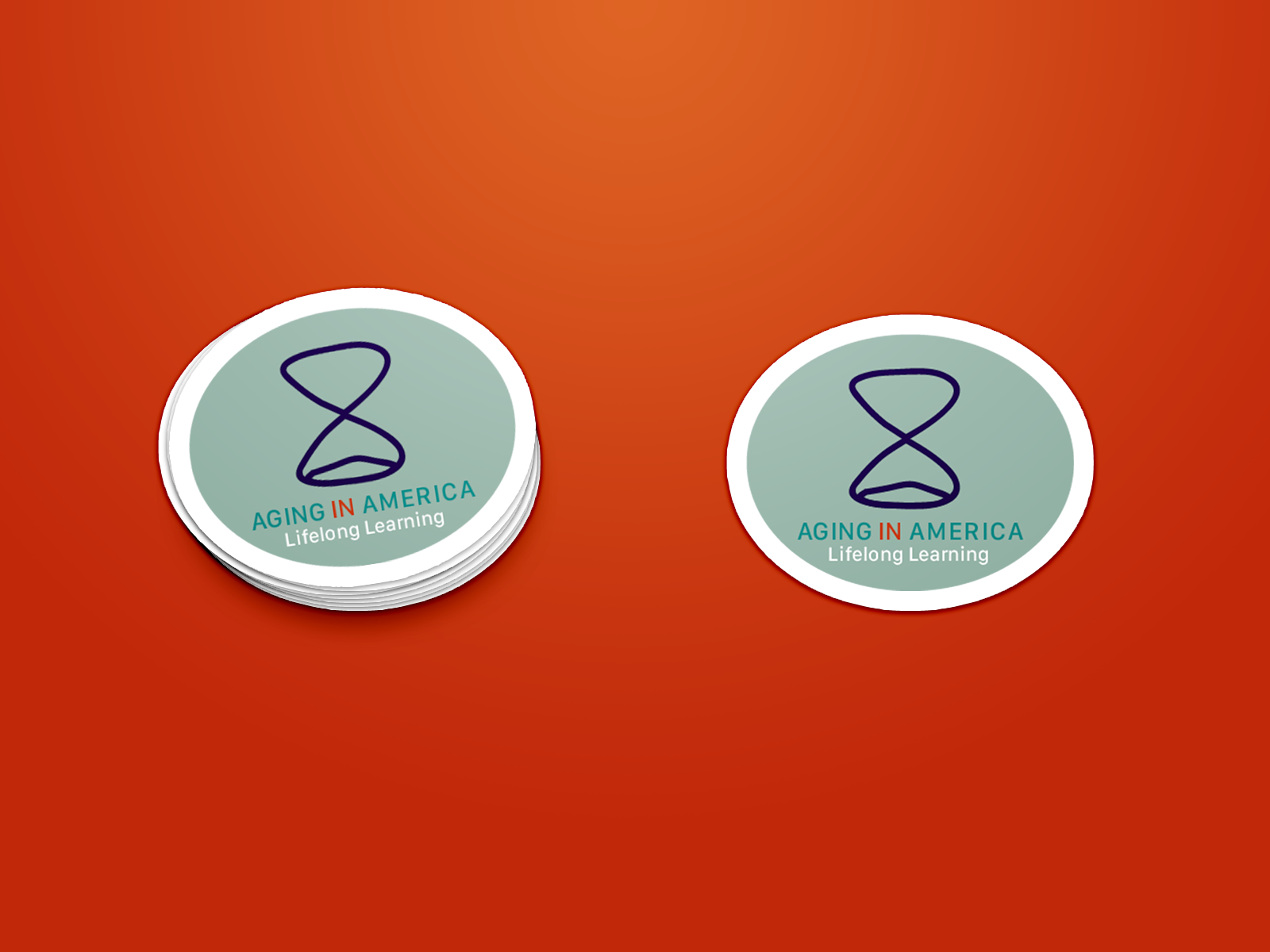
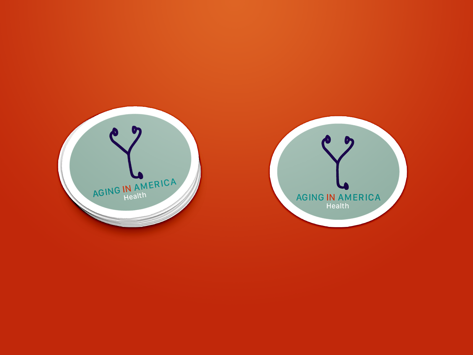
Icon System
The hand rendered icon series are cohesive with the lines that will be seen throughout the brand. They add to the "fun" side of the conference. They also help with organizing the information as before it was very overwhelming and hard to navigate through.

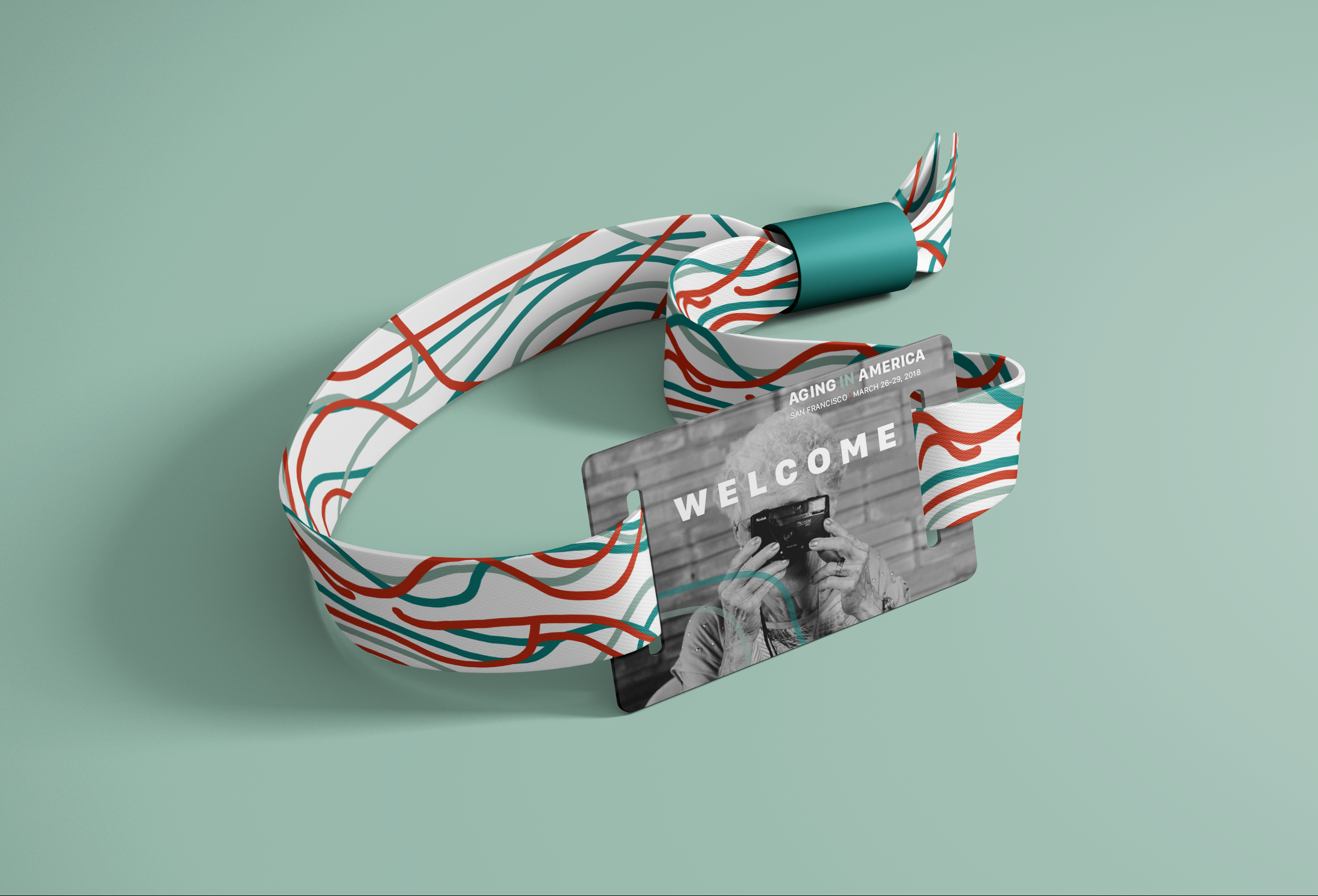
Welcome Package
This touch point is fun because it adds to the entire experience of the event. After registering to the conference a few weeks before it begins attendees get sent this small package to get them excited for the event. The package comes with a poster as shown on the top left. Then a colorful bracelet that also doubles as a parking pass for the event. Then you receive stickers according to the field you showed interest in.
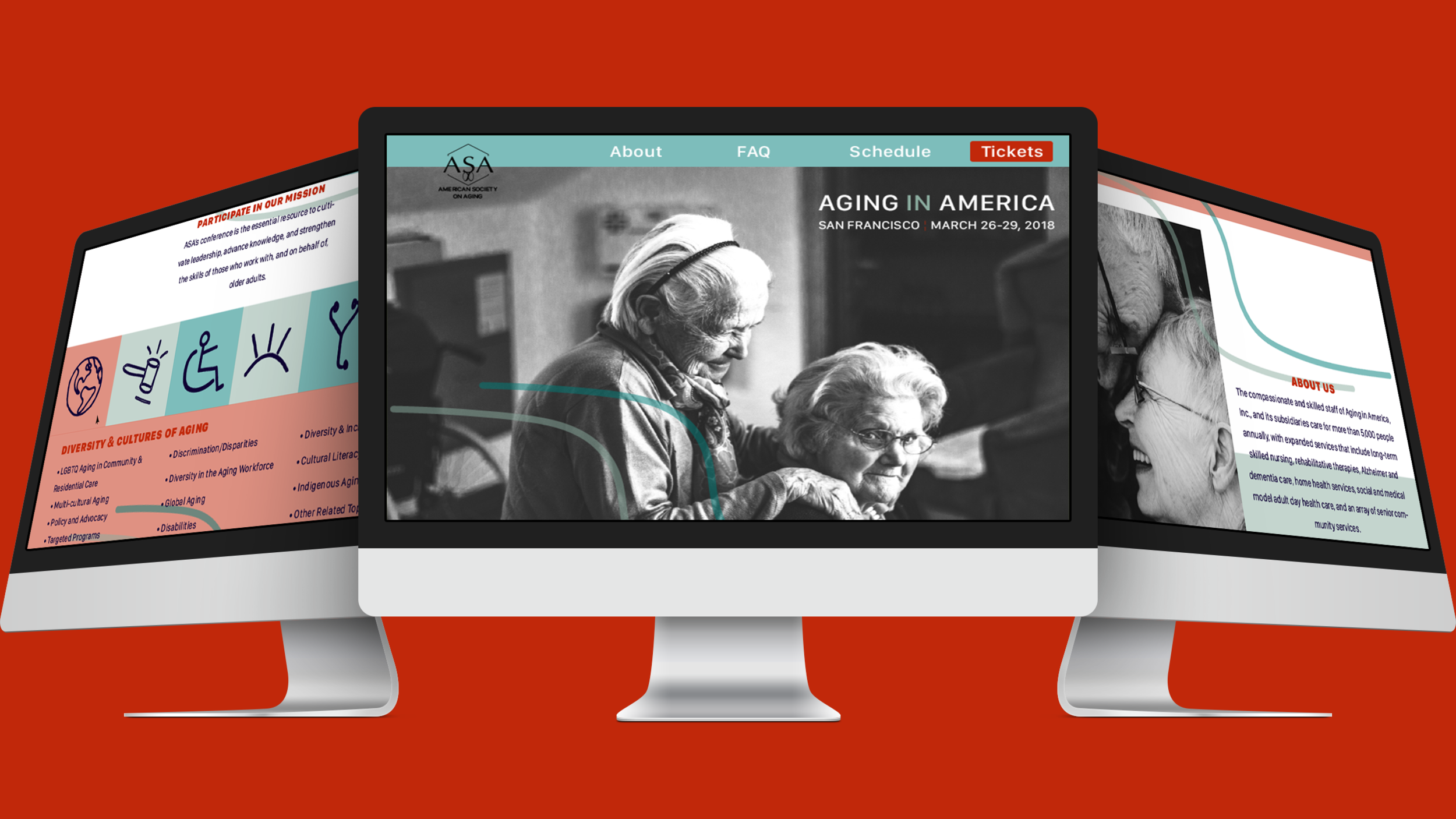
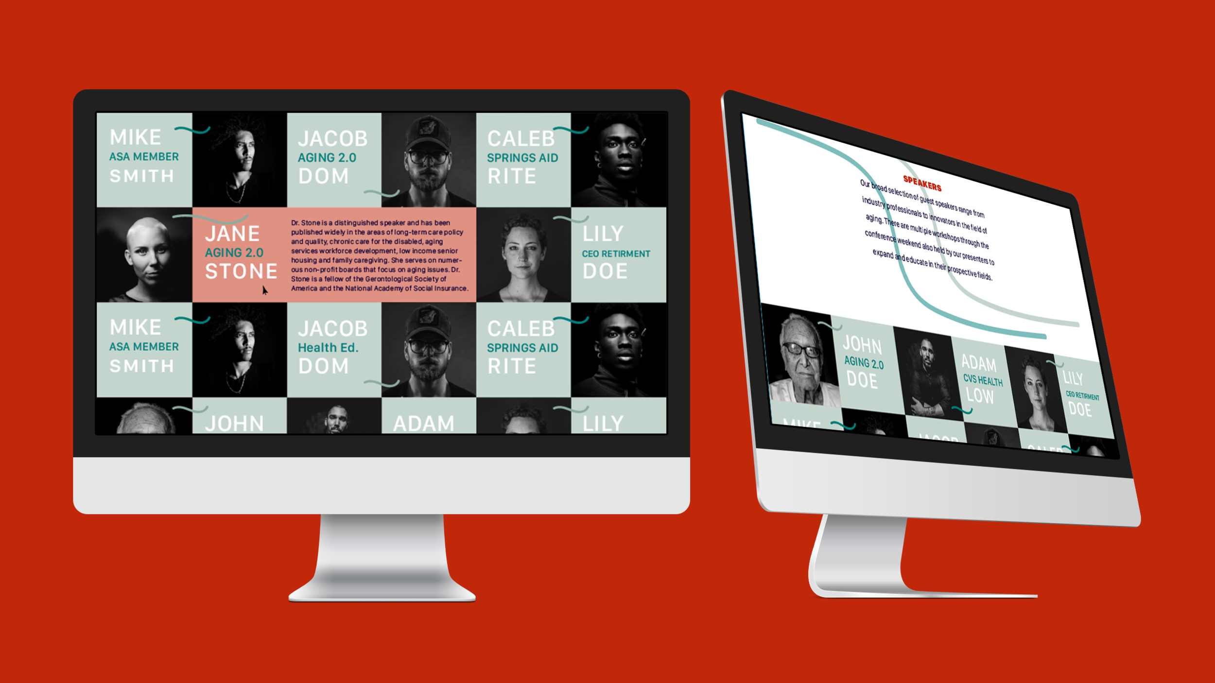
website
The website is clear and to the point, so navigation is a breeze. The colors are muted with low opacity so it's not harsh on the eyes. The playful lines break the planes to add a nice free easy-going mood to the design. With so many speakers the page had to have all the proper information but organized in an efficient manner. The speakers name and photo expand if hovered over to reveal more information on the speaker. The most important speakers have images shown while the ones with smaller workshops are shown below them with links to their bios.


Signage
The directional signage point attendees towards the specific exhibit halls they are looking for. If you see the arrows that means keep going, if you see just lines then you're in the right place! The big billboard welcomes attendees old and new so they know they have arrived to the right place. The roadside sign ignites curiosity and intrigue as well as advertising the conference.


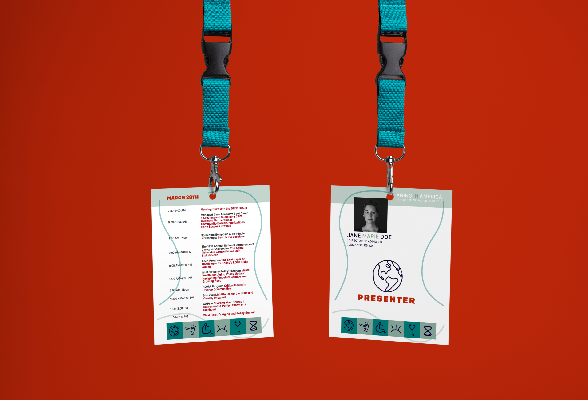
badge
The badge has the days schedule on the back that is interchangeable each day while the front is to gain access and represent who you are. The icon system is used so you know who is interested in what category or whom is a part of the speakers for that specific section of interest.


For more of an in depth look at the research/process > https://spark.adobe.com/page/2eZdUSEUtiZ3I/


