
Cuarto Azul
Branding. UX/UI. Art Direction.
About
Blue Note is a jazz club located in Monterrey, Mexico. It is known for serving up some of the best cocktails in the cheapest cups while hosting live bands of jazz influence. It is in a very touristy part of town where the subtle speakeasy & intimate vibes are appreciated.
The Solution
The intension is to do a total rebrand including the name, the logo, and the entire aesthetic of the company by incorporating what social media is fueled by which is photographs, strong typography, and an air of mystery. It needs to be updated to a much more modern look and vibe.
The Problem
Blue Note Jazz Club lacks identity and allure to the younger generations that it intends to target. Jazz clubs historically attract older crowds and Blue Note wants their rebrand to bring in the social media generations.
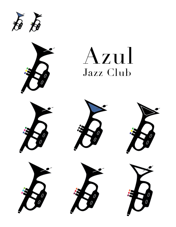
Logo Progression
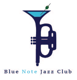
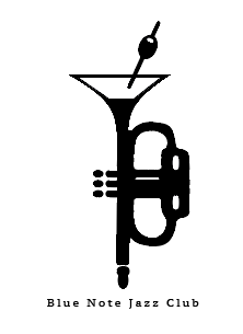
Here we can see the brands original logo with the martini incorporated in the trumpet. It had an odd shape and the colors weren't very pleasing to the eye. So having tweaked the design to make it a bit more clean and polished with pops of colors; It still felt like it wasn't portraying the right vibe we were aiming to take the brand. It was pushed to a more typographic solution that resembled neon signs.
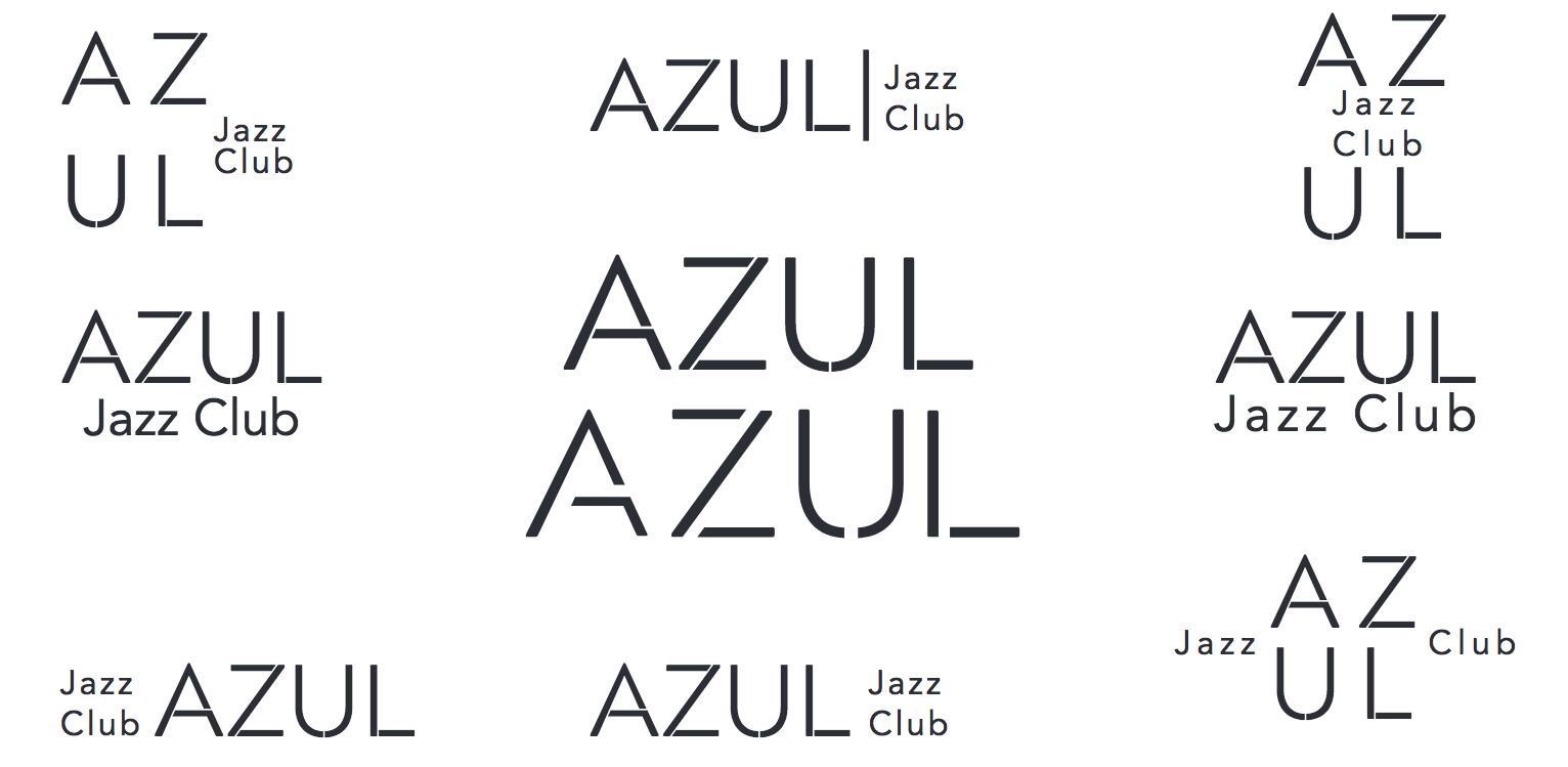

Final Outcome
It was pushed to a more typographic solution that resembled neon signs. There are gaps in the letters as seen on glass neon signs. Jazz club was then omitted and the name of the bar was changed from Blue Note Jazz Club to Cuarto Azul to pay homage to the locals since it is located in Mexico. Cuarto Azul translates to Blue Room. Simple, elegant, modern, and perfect for the new direction of the company.
Mood Board
This shows the decided direction to take the brand. It's called Neon Blues and it is a very vibrant yet dark and mysterious aesthetic. Lively while not being over the top and too "in your face". The colors invoke mystery and entice viewers to look like moths to a flame.

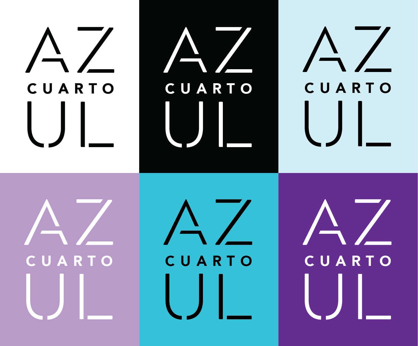
Style Guide
The four main colors that are seen throughout the brand are shown in the different variations of the logo. The types used were, again, to portray neon signs with the custom typeface in the logo and Sign Painter for the added tagline “follow the mystery” discussed further down. Avenir is a nice sans serif front to add readability and simplicity to the headline texts.


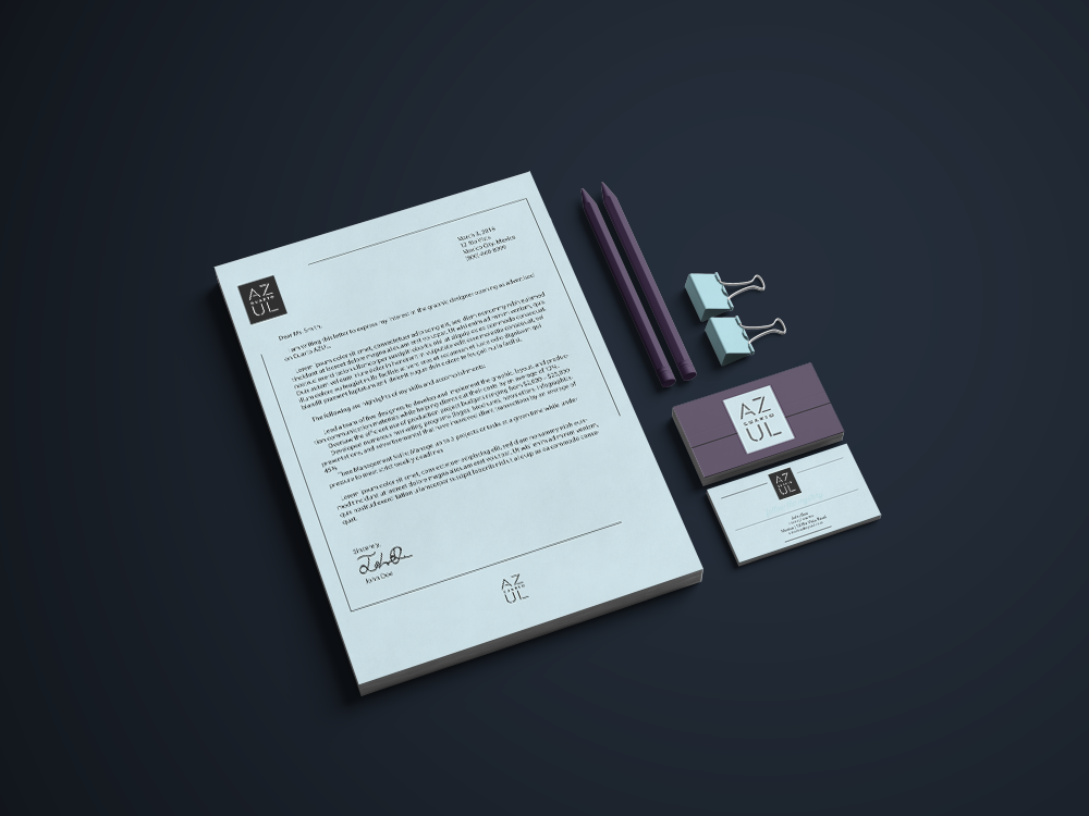
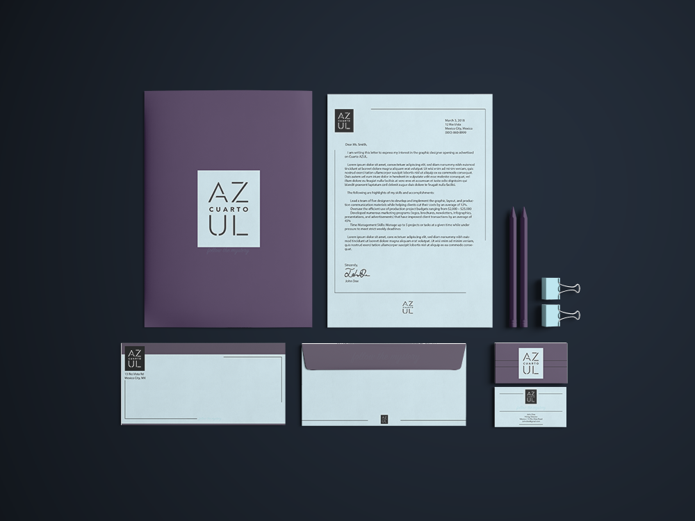
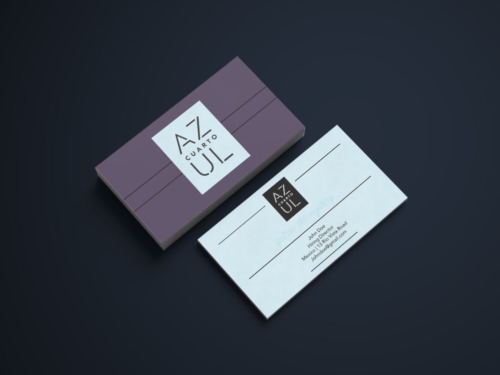
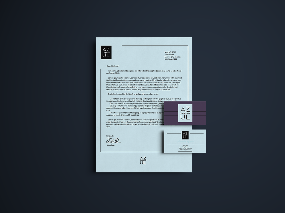
Stationary
Here the company colors are muted and not very vibrant for professionalism and readability. Although the stationary sets seem not to hold the neon elements at first, if placed under a black light the paper glows. The graphic elements of the lines are integrated just like neon signs have lines that end and begin almost randomly due to the wiring. It stays true to the simple yet eye catching vibes of the company.
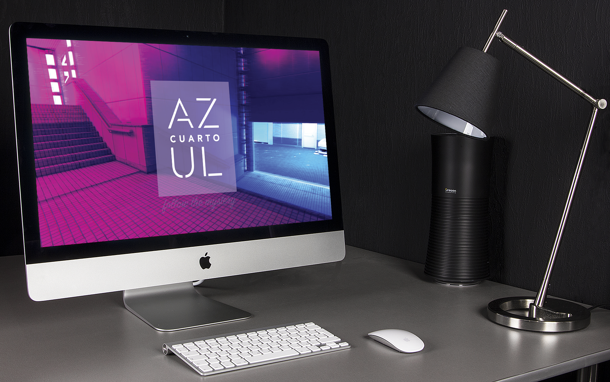
website & social Media
Since the target demographic is revolved around electronics and spends most of their spare time on the internet the enter page is what has become common among modern sites. It's a strong graphic with the logo placed front and center with the tagline placed very discretely below it. Stating "follow the mystery" the website immediately grasps the viewers curiosity as they click to enter. Then the viewer is taken to the home page where they can access the history of the company and then view the social media feeds that are constantly being updated from the consumers due to our brand encouraging picture taking and interacting with the décor. The brand is heavily image driven to place focus on what appeals to the social media generation most.
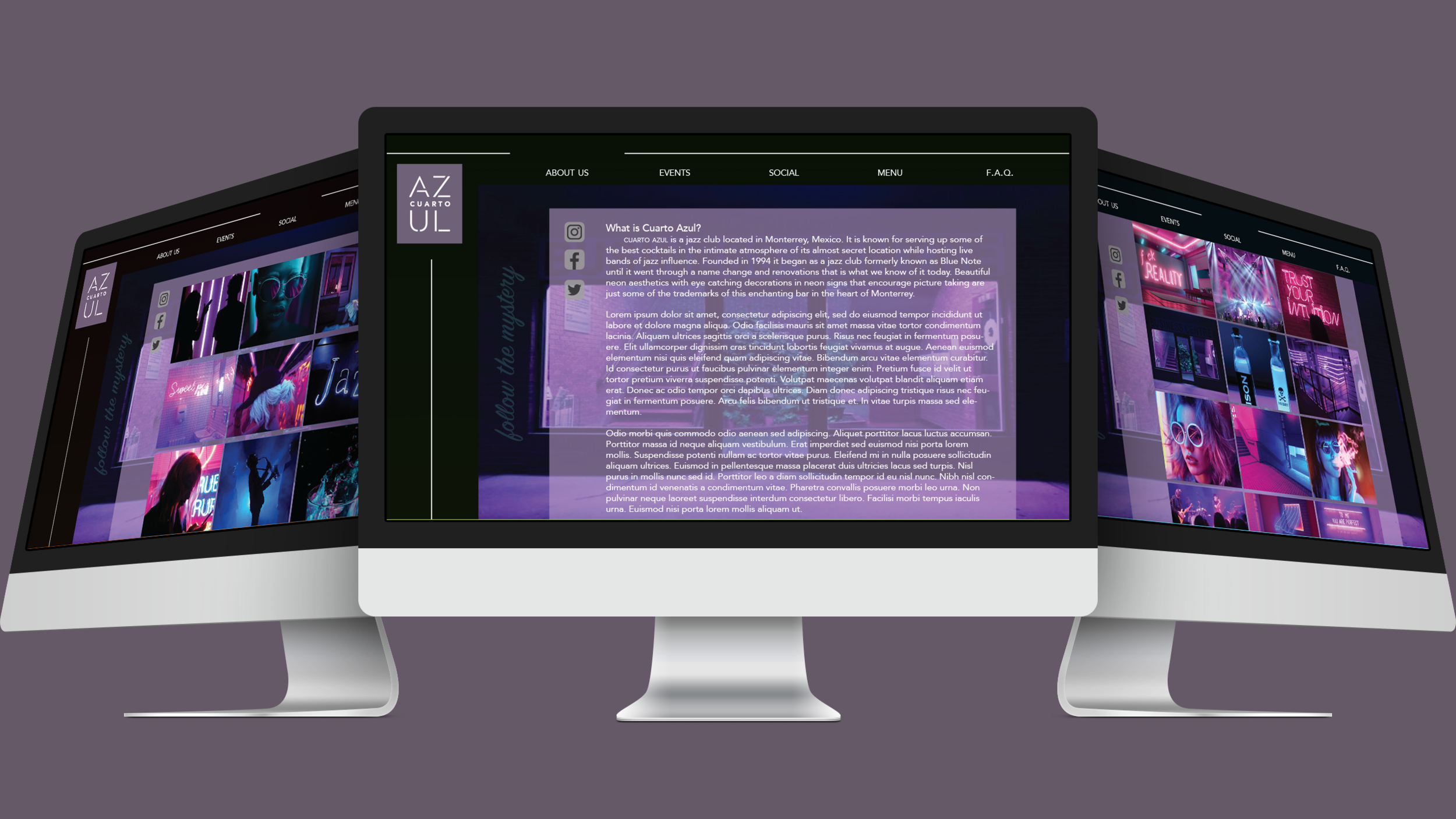
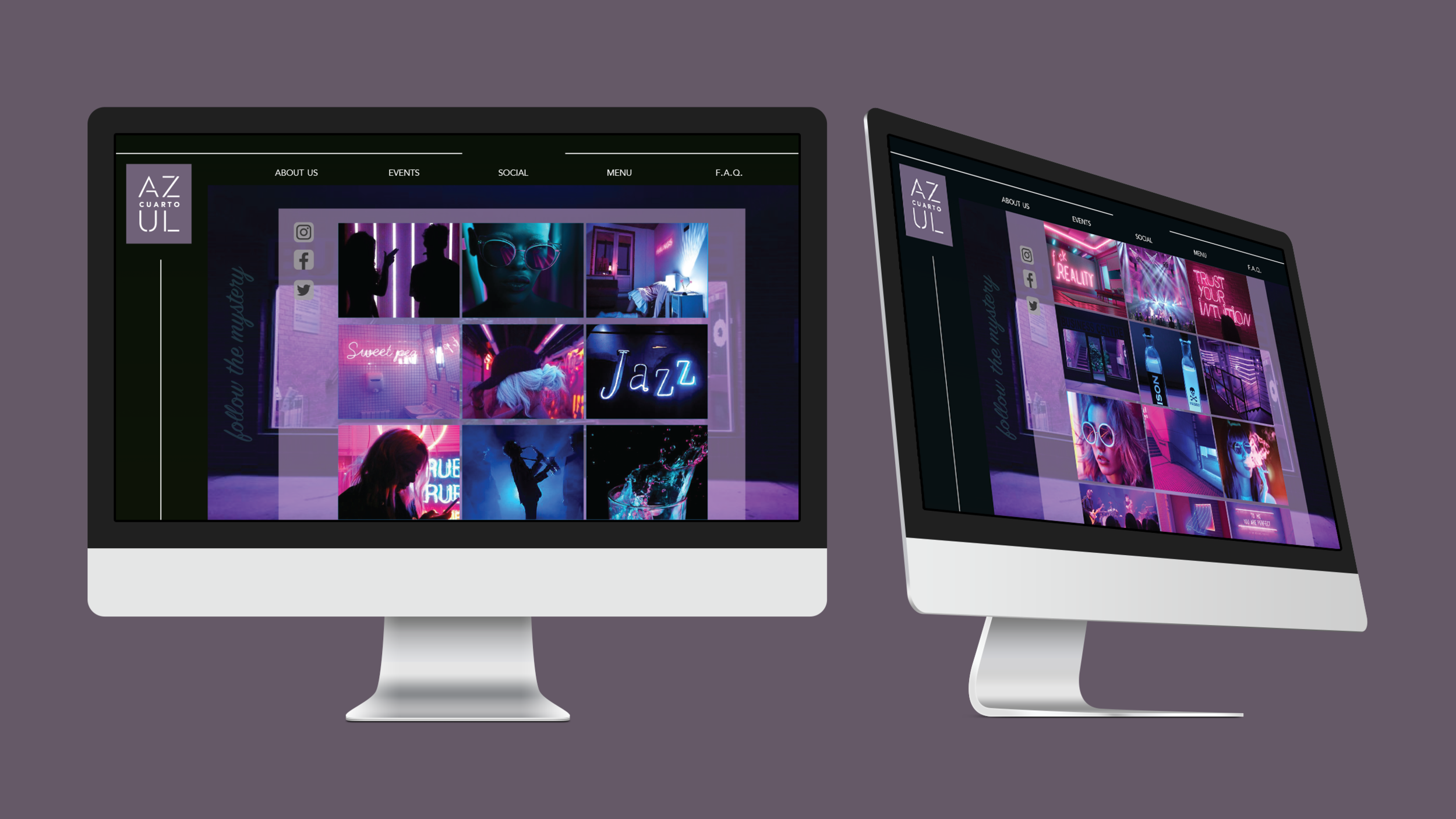
The website takes imagery directly from the social media streams such as instagram as shown below and places directly on our page.


Uniforms
The uniforms are a fun touchpoint due to how the lighting in the bar is set up. The black-lights set up throughout the bar make the collar, sleeves, and logo glow and since it is placed on a black shirt it gives the illusion of a floating logo which is unique to our brand and will provoke the consumers to take a picture for their socials.

In normal light

Under black light
menu
Again the strong graphic elements are apparent with the subtle imagery in the background of the menu. The typography is in white which is black light reactive as well so it will seem as if the words themselves are glowing off the page. The drinks are Spanish influenced again to pay homage to the locals in the area. The menu highlights the specials for the week. Also featuring the tagline “follow the mystery” again.

Matchbox
This touch point is a take away that people may have with them featuring the logo and the tagline. People like free things especially ones that are useful so this will be good to have for the consumers. This also prompts potential consumers to ask about the matchbox if they see it in use.

Advertisement
The advertisements utilize what the website's enter page had. This pull to explore deeper into “What Is Cuarto Azul”, has the consumer proceed to "follow the mystery" to the website. The ad is simple ,alluring, and blunt. The beautiful imagery captivates the attention then sends them to the website to find out more.


For more of an in depth look at the research/process > https://spark.adobe.com/page/2eZdUSEUtiZ3I/


